
Quick Parking
A Cloud Native system for smart parking guidance and security management.
Design Context
This project was a course extension, based on real-world issues with parking in a crowded office. With many employees and limited parking information, drivers often waste time searching for spaces. We aimed to create a system that helps drivers find parking faster and makes management easier for staff.
What We Did
- Built a real-time display showing how many spots are available and where they are.
- Designed a tool for security staff to check who used specific spots during the day.
- Showed daily parking data to help improve space use and management.
Research

To better solve parking problems, we used a user-centered design process: Persona → User Journey → Feature Prioritization → Pain Points & Needs. This helped us design features that truly match what users need and how they behave.
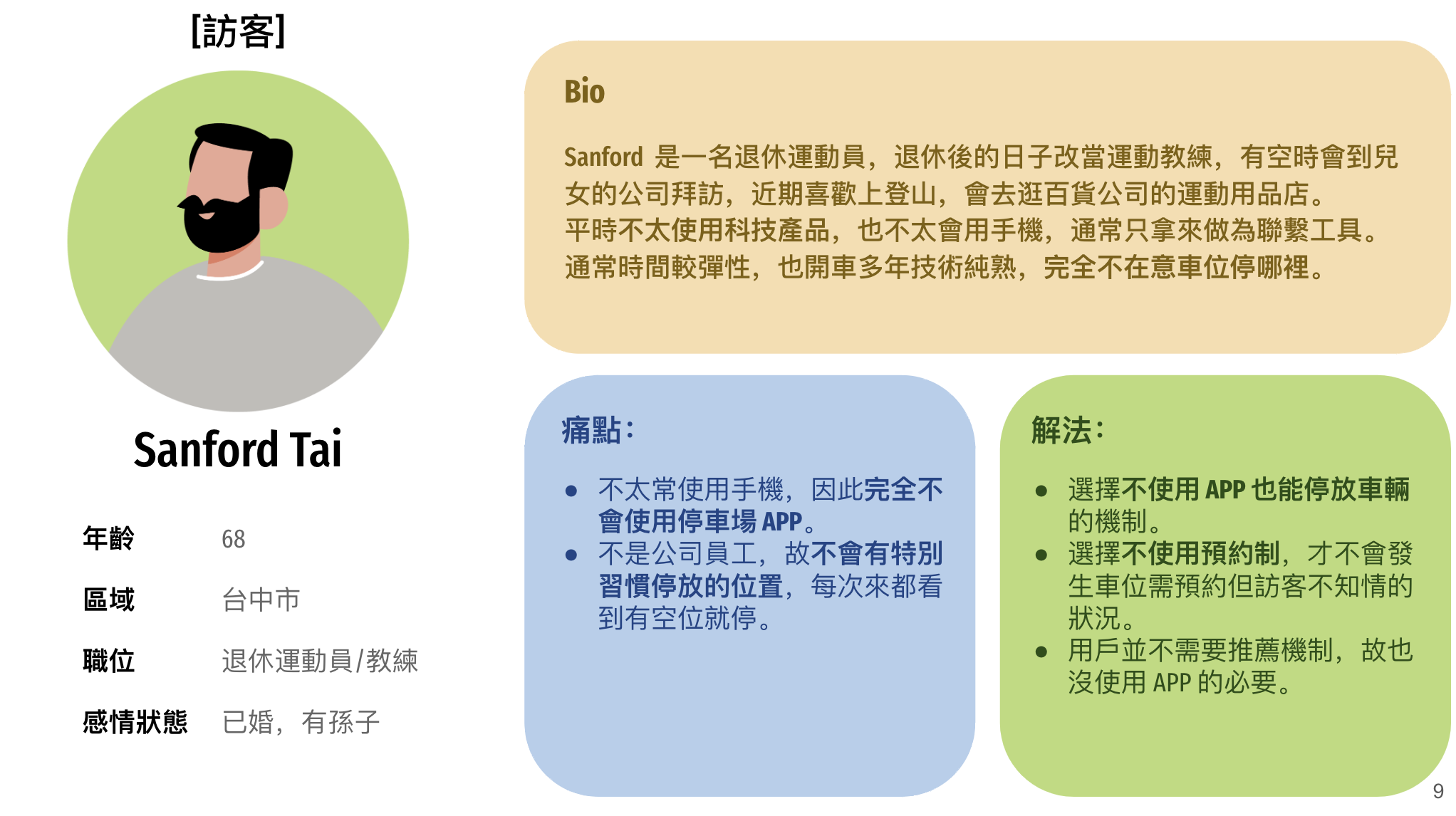
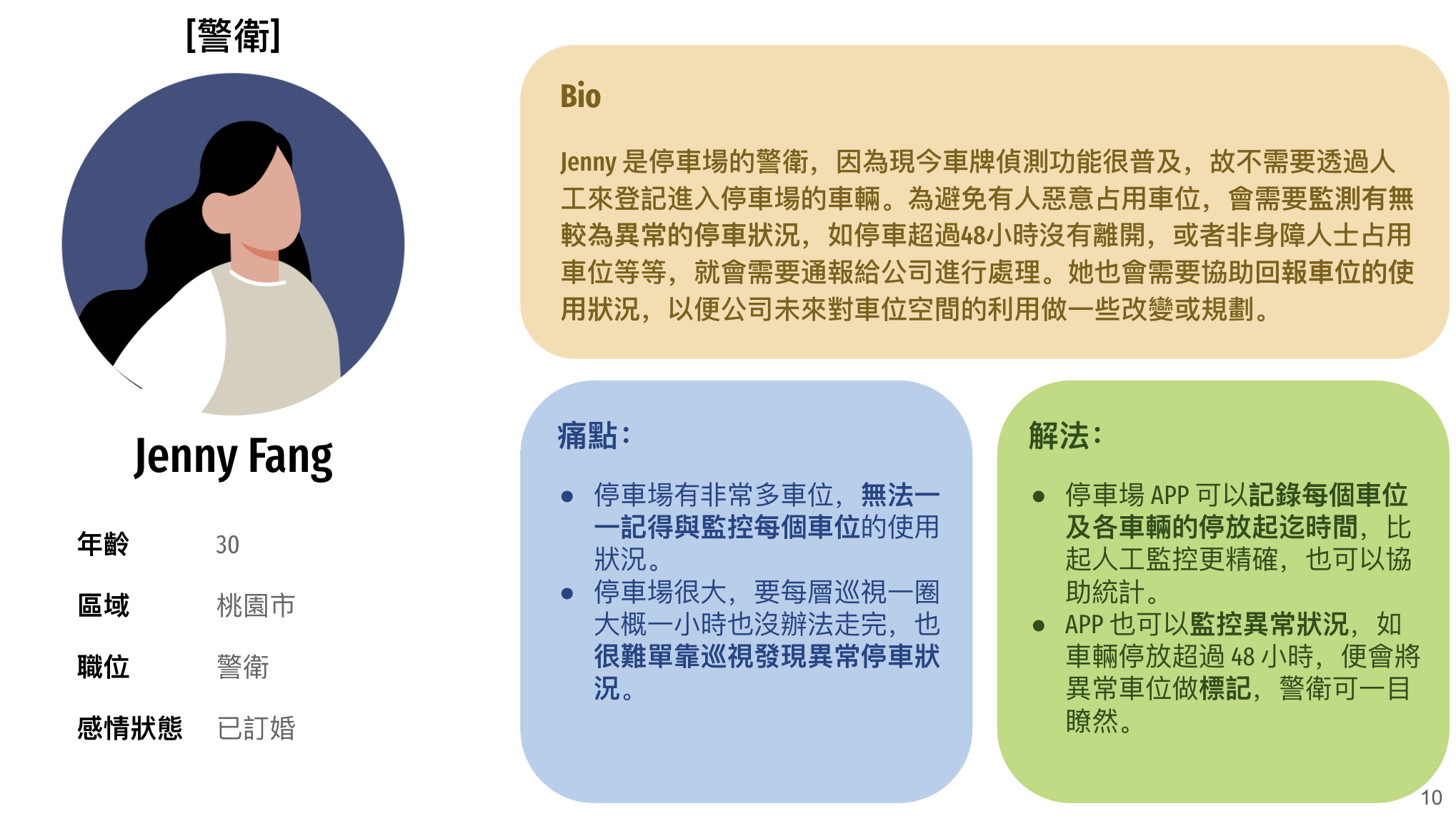
Persona Development
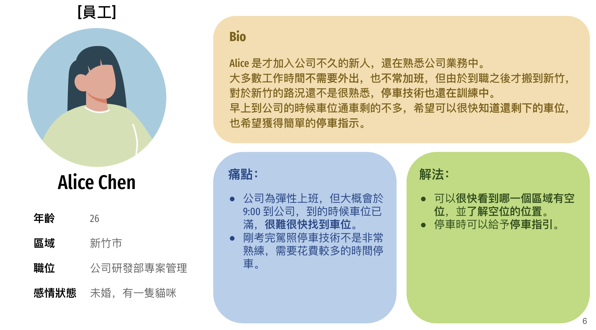
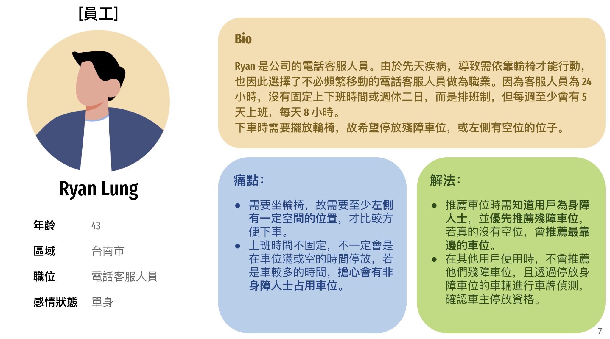
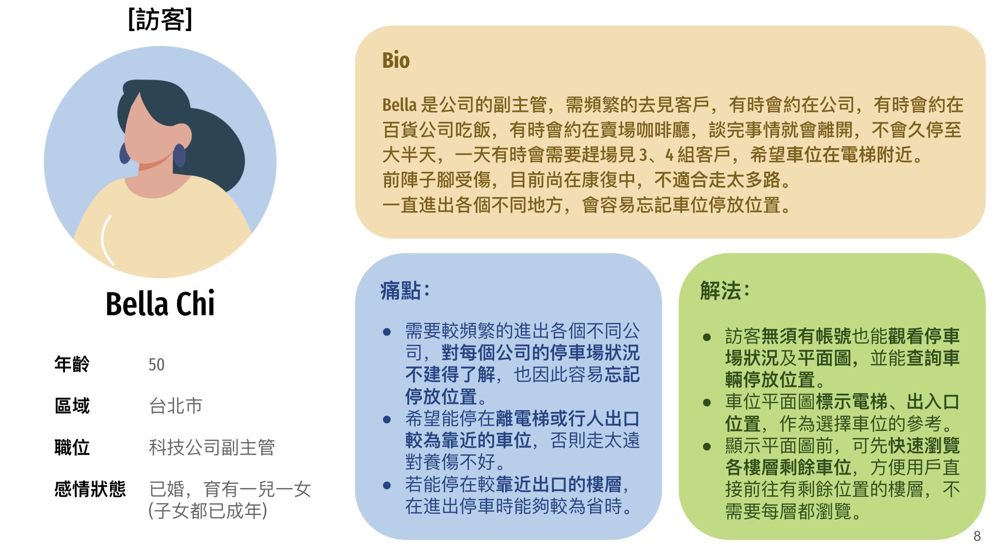
Based on an analysis of user behavior in the parking lot, I developed five user personas representing a range of needs and age groups, including corporate employees, visitors, and security staff. Since the core goal of this project was to improve parking efficiency and user experience, it was essential to ensure that each user type could easily find, use, or manage parking spaces.
User Journey Mapping
Next, we mapped typical user scenarios, from entering the parking lot to finding a spot, parking, and leaving. This revealed moments of friction, such as first-time visitors getting lost, or employees struggling to find spots just before 9:00 AM. By visualizing these journeys, we uncovered key opportunities for design interventions—like integrating navigation and entry-point-based spot suggestions.
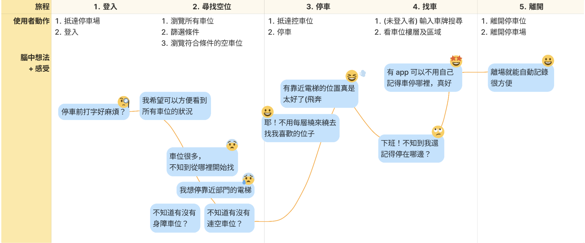
Userjourney
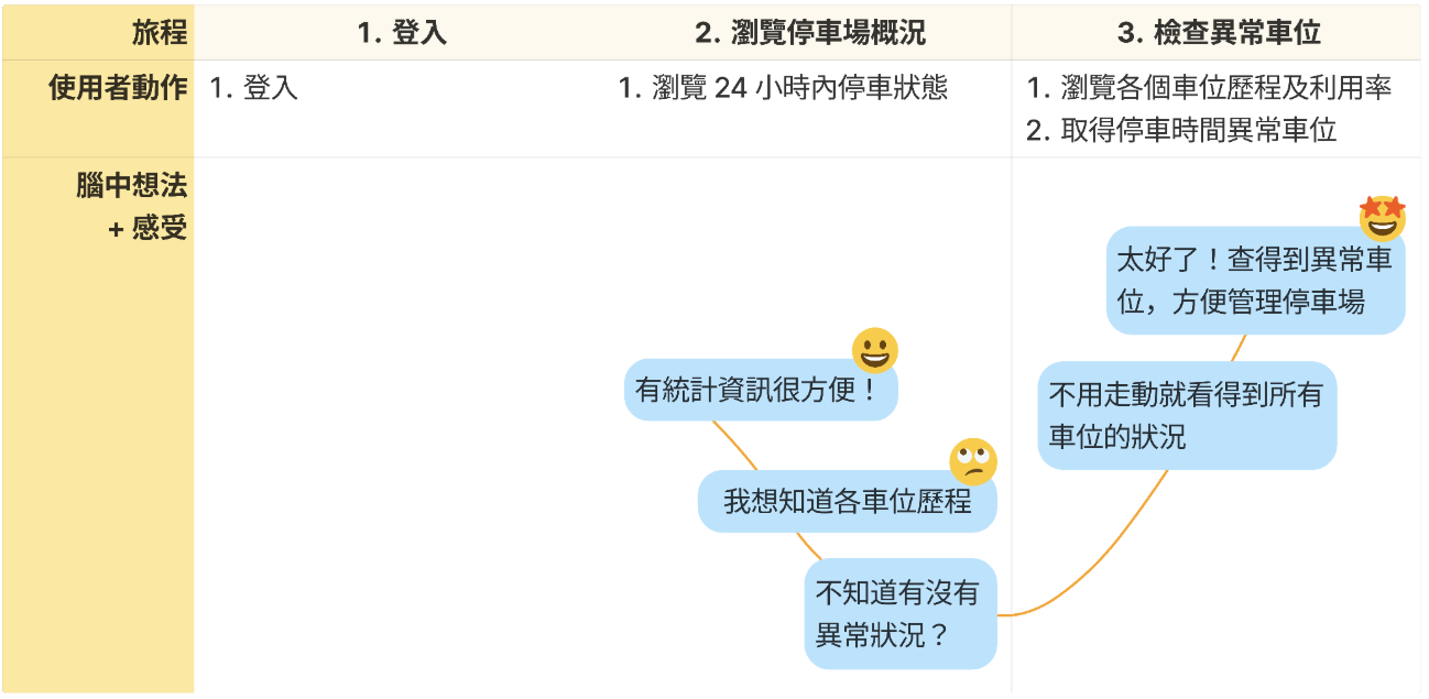
Guardjourney
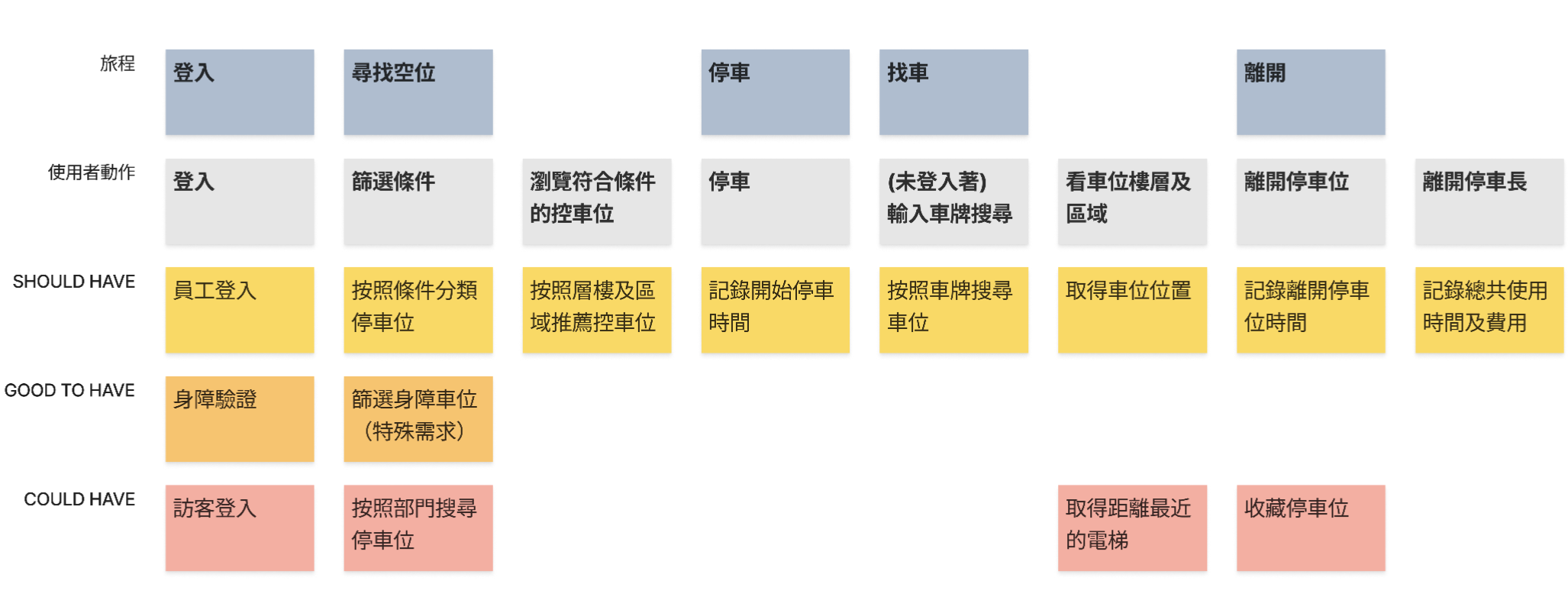
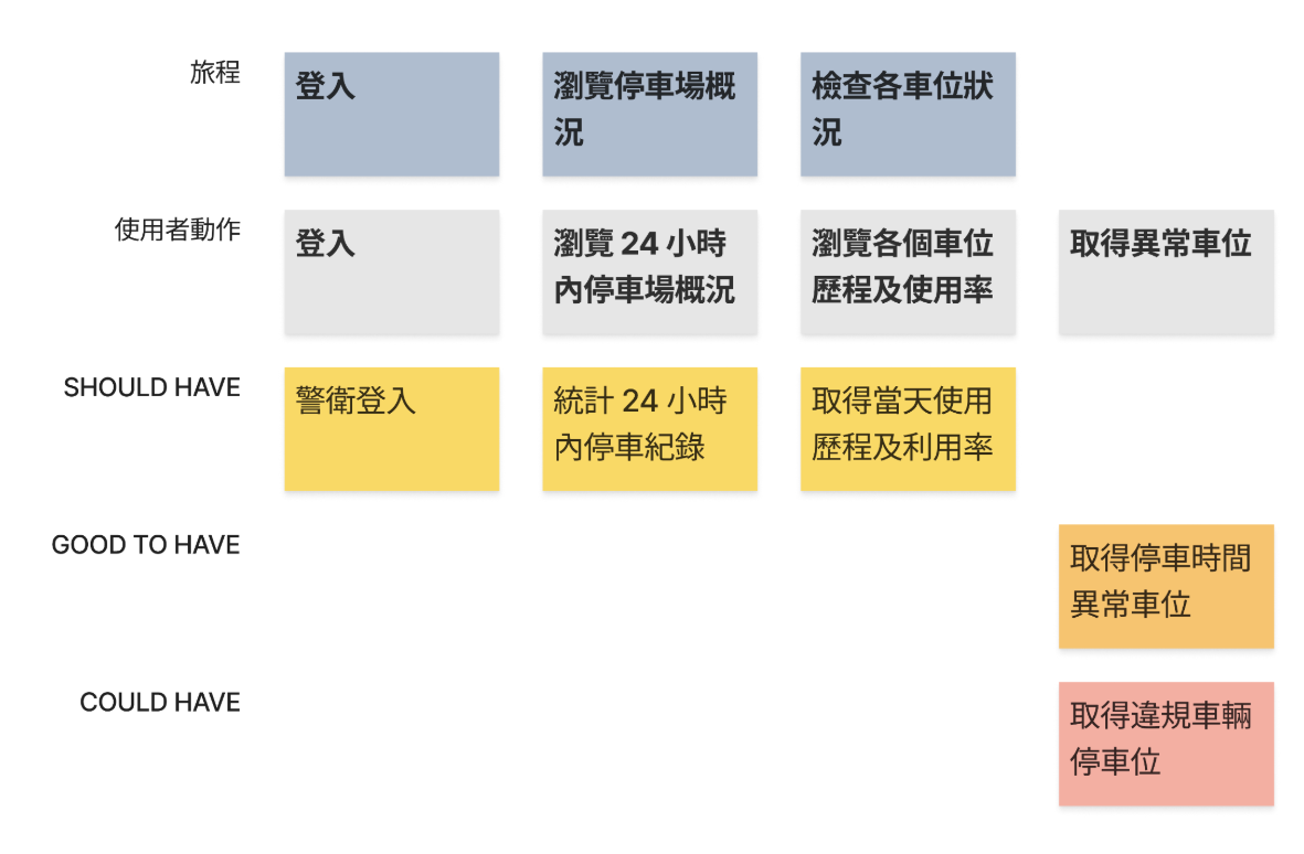
Feature Prioritization
We translated insights into clear, actionable features based on frequency, urgency, and feasibility. High-priority features included:
- Real-time parking availability map
- License plate-based car locator
- Visitor-friendly interface without login
- Security dashboard for long-term spot usage
Userjourney
Userjourney
Pain Points & Needs
Finally, we consolidated the design direction through a detailed pain point and needs table.
Key problems include:
- Difficulty finding parking during peak hours
- Poor orientation in the parking facility
- Lack of visibility for parking management staff
- Inaccessibility of special needs spots
- Lack of transparent parking information
| User Type | Pain Points | Needs / Solutions |
|---|---|---|
| Employees |
|
|
| Visitors |
|
|
| Security / Management Staff |
|
|
Design
This design phase includes User Flow Design and Hi-Fi Prototype. It is based on key needs found in user research. We use flow diagrams and clear visuals to help different users—like employees, visitors, and security staff—complete tasks easily. The goal is to make the system easy to use and the information easy to understand.
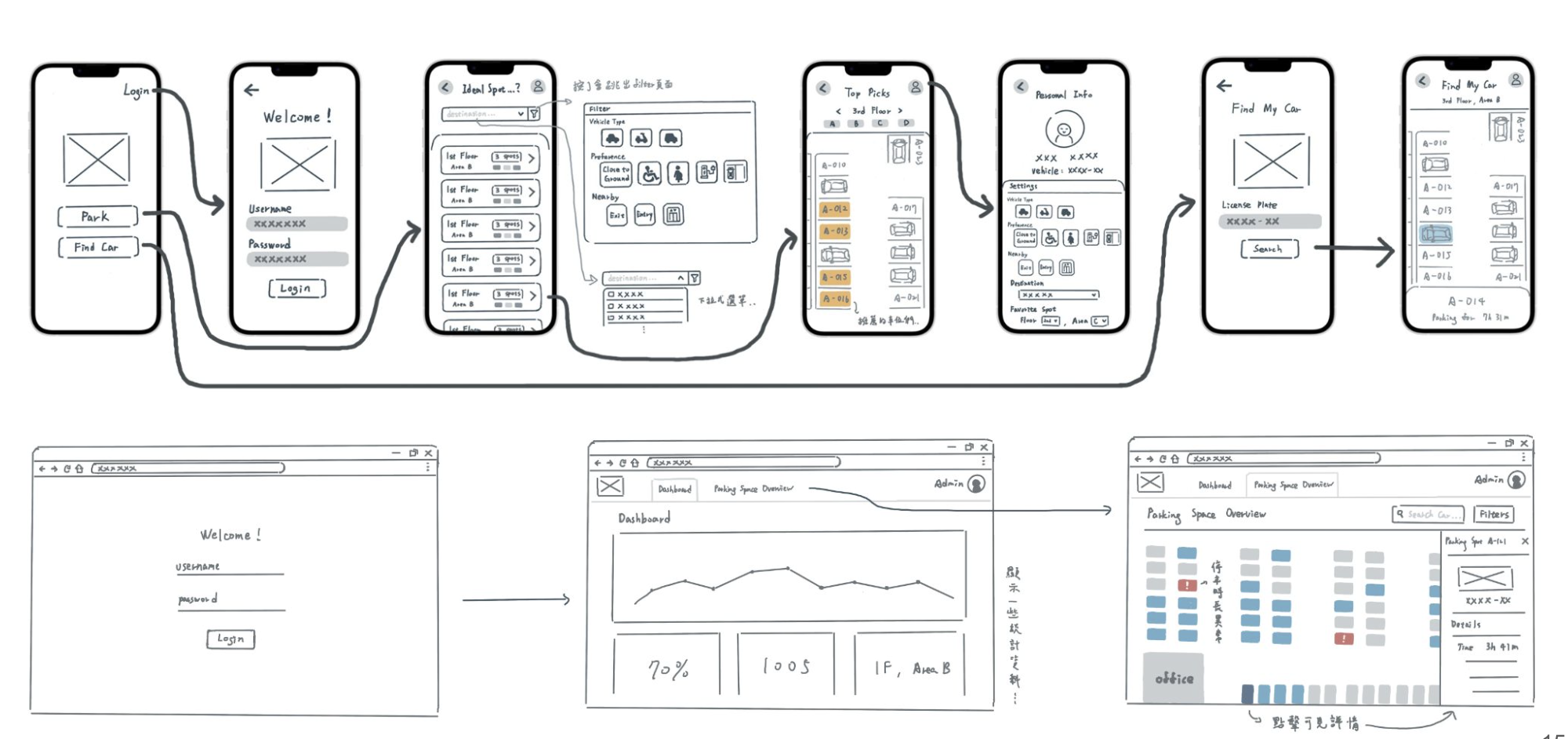
User Flow Design
Based on early user research, we created a complete user flow diagram to show how different users—employees, visitors, and security staff—interact with the system. This diagram helped us confirm that key features (such as live parking space search, car locating, and abnormal vehicle alerts) meet the needs of each user type. It also served as a guide for the later interface design.
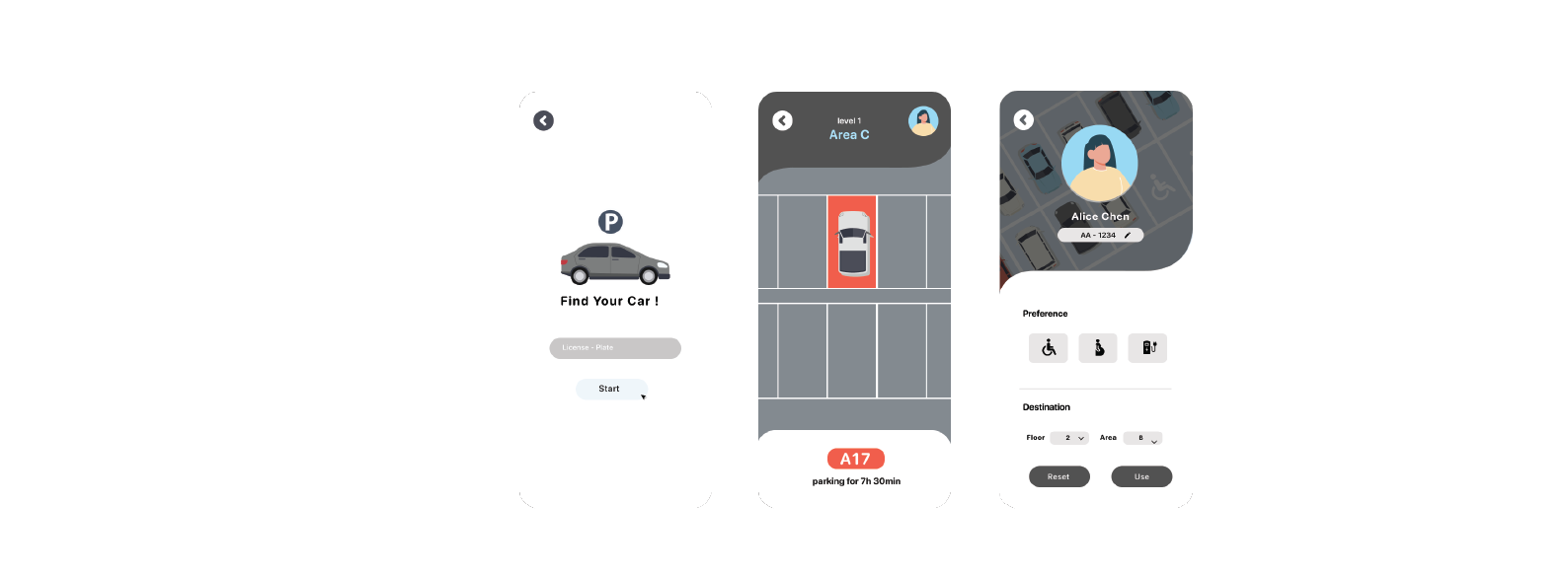
1. Employee Features
- Login and Settings: Log in to set car info and parking preferences (e.g., near elevator, basement).
- Real-Time Search: Filter spaces by floor or area, with accessible parking options.
- Find My Car: Enter license plate to locate your car.
2. Visitor Features
- No Login Needed: Check parking availability without an account.
- Elevator/Exit Info: See elevator and exit locations for easy access.
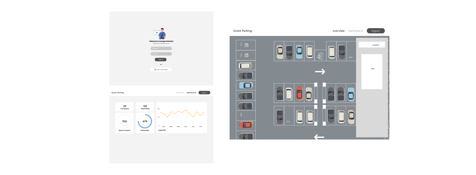
3. Management Features (Security Staff)
- Admin Dashboard: View real-time usage and stats.
- Abnormal Vehicle Alerts: Flag long-term or rule-breaking cars.
- Vehicle Search: Find car details by license plate.
4. Interaction & Visual Design
- Icons & Labels: Clear icons for parking status and preferences.
- Color Coding: Colors show available, occupied, or long-parked spots.
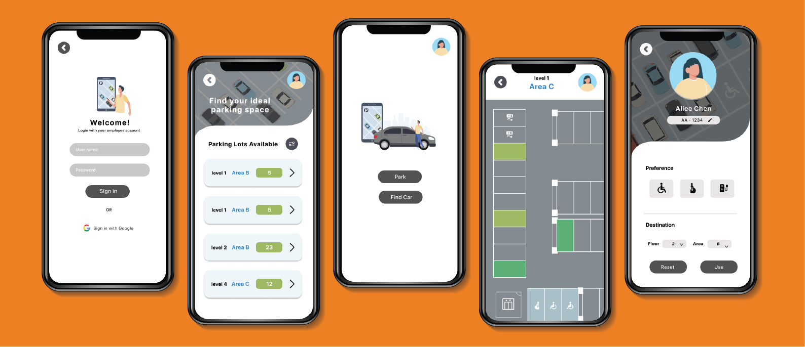
Hi-Fi Prototype
- Uses visual elements and color cues to improve information clarity and user navigation.
- For drivers, the interface offers custom settings and parking filters (e.g., near elevator, accessible parking) to help them quickly find a spot near Lin Chin's office.
- For security staff, the interface keeps a consistent visual style, with data charts and vehicle info lookup tools to enhance monitoring and management.
- Overall, the design improves efficiency and ease of use across all user types.
Reflection
This project helped us better understand the real needs of different users in a parking system. From user research to final prototype, we focused on clear flows and easy-to-use interfaces. While there were some challenges, especially with timing and coordination, we gained valuable experience in turning user needs into a working solution.
What’s Next?
System Testing and Optimization
- Test on different devices and browsers (mobile, tablet, Chrome, Safari, Edge) to make sure the UI works well everywhere.
- Improve system performance by testing API speed, database queries, and front-end loading under heavy use.
More Personalization
- Let users save favorite parking zones for quick recommendations next time.
- Use AI to suggest parking spots based on user habits (e.g., near elevators, lower floors).
Better Accessibility
- clear color contrast, adjustable text size, and screen reader support.
- Improve accessible parking with voice input or easier filters to help users with disabilities.
Project Takeaways
- Design took longer than expected, especially adjusting user flows and details, which delayed the Hi-Fi prototype.
- It was hard to keep front-end and back-end work in sync—changes to UI meant both sides needed quick updates.
- We learned to leave more time for design changes, align API and UI earlier, and test complex features (like real-time updates) sooner.